

Understanding Colour Theory in Interior Design
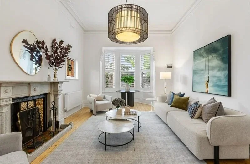
Adding colour to your home can be a daunting task. How do you know what colours to choose? What colours work well together? The stylists at Property Society Co are experts in colour theory, allowing them to perfectly craft your vision.
When styling your home, it is important to take colour theory into account and utilise the principles involved to make your home look its best, whether it is for sale or for living.
The Colour Theory Basics
Colour theory is a fundamental concept when it comes to interior design, including the colour wheel, colour harmony, the emotional impact of colours and how they can be manipulated.
By mastering colour theory, designers are able to create spaces that evoke desired emotions, maintain visual balance, and create interest. Colour theory is a vital part of the design process, influencing not only aesthetics but the psychological and physiological responses elicited by those within spaces.
Making informed decisions on palettes is greatly assisted by embracing colour theory’s principles. Understanding the relationship between certain colours and how to manipulate them allows designers to craft a cohesive and harmonious interior that aligns with the client’s vision and the spaces intended purpose.
The Emotional Impact of Colours
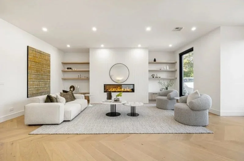
Colours possess the profound ability to evoke an array of emotions, transforming blank spaces into sanctuaries of feeling. By strategically leveraging hues, Property Society Co’s stylists can craft ambiances that either soothe or invigorate viewers. We believe it is important that designers understand the psychological nuances each shade conveys in order to utilise them effectively when styling a space.
Warm colours will inject a room with cosiness and energy, while cooler tones will evoke tranquility and spaciousness. This psychological dichotomy plays a crucial role in interior design, dictating the overall feeling of a space and influencing inhabitants’ mood and mindset.
By manipulating colours, our property styling team can dramatically alter the perception of a room’s shape and size. Darker shades, for example, tend to make a space feel intimate and protected, while lighter tones expand a room’s appearance, generating an open and airy atmosphere.
Mastering the emotional impact of colours is key for achieving the desired outcome in any residential or commercial environment.
Complementary Colour Schemes
In interior design, complementary colour schemes are fundamental in achieving visual balance and harmony within a space.
Blue and Orange create a striking balance between soothing and invigorating tones.
Red and Green offers a Christmas-themed contrast that can be toned down to make a room feel sophisticated.
Purple and Yellow introduced a regal elegance to spaces, balancing richness and brightness.
By utilising colours directly opposite each other on the colour wheel, stylists produce a dynamic yet cohesive aesthetic. Property Society Co employs these schemes to instantly elevate a room’s energy and captivate the eye without overwhelming the senses.